Monday, August 2, 2021

Non-Western Art

 Nihonga Movement

The Nihonga movement started in 1882 as a direct result of the forced opening of Japan in 1853 during the Meiji Period. While in Europe this new trade inspired Japonisme, art made by Europeans inspired by Japanese culture, this art exchange also inspired Japanese artists to create art inspired by Western culture and they called this style Yōga. While all of that was happening, there were Japanese artists who wanted to preserve the classical style of Japanese art, and thus the Nijonga movement was born. 

While the artists do end up adopting some elements of Western art (such as realism) into their art, they very much remain true to tradition. They also opened up the subjects of their paintings rather than stick strictly to traditional art subjects. The Nihonga movement is still an active art movement within Japan today. 

The Art

Hashimoto Gahō: Dragon Against Tiger (1899)

Dragon Against Tiger (1899) by Hashimoto Gahō in Japan. Image courtesy of The Art Story.

This piece is cited as what convinced artists that adopting elements of Western art can help enhance the traditional elements. Kanô traditionally depicts two creatures and leadership symbolism, and Gahō combined this with realism from Western art to create a Nihonga piece. He also painted this on silk, keeping with traditional methods of painting.

What I like about this piece is how striking the waves are, they are what my eye is drawn to first, followed by the tiger. One thing that could be stronger is the dragon, who is almost lost in the upper right corner of the painting, I had actually missed the dragon completely the first few times I looked at the painting. For a powerful creature, he doesn't have a powerful presence in the piece.


Takeuchi Seihō: Tabby Cat (1924)

Tabby Cat (1924) by Takeuchi Seihō in Japan. Image courtesy of The Art Story.

This is another painting on silk, this one combines realism with a Ukiyo-e style of negative space and theme. Seihō featured landscapes and animals in his works, and he was leading the Nihonga style in Kyoto.

This is one of my favorites because of how simple it is, but also how realistic the cat is. The vibrant green eyes hold your gaze and give it a sense of seriousness, but the cat is just grooming itself. I also like the contrast of the realism and the negative space background, so your focus is solely on the tabby. 


Tsuchida Bakusen: Still Life - Salmon Slices and Sardines (1924)

Salmon Slices and Sardines (1924) by Tsuchida Bakusen in Japan. Image courtesy of The Art Story.

Tsuchida Bakusen started off as a Buddhist monk before he would leave monkhood in favor of painting. He studied under Seihō, from the previous art piece in this blog, and used his Buddhist background as inspiration for many of his works. He also was interested in post-impressionists and used other European art as inspiration and wanted to push Nihinga into a more modern direction. 

What I like from this work is the number of curves present, and it is balanced by the few pieces of sardines that are in straight lines. The vibrancy of the salmon is accentuated by the muted colors of the surrounding objects. You can see the influence of other art styles as it is not as muted as traditional Japanese art and the fish have a sense of realism. 


Football (2006 FIFA World Cup Germany) by Hisashi Tenmyouya

Football (2006) by Hisashi Tenmyouya in Japan. Image courtesy of PicassoMio.

To emphasize that Nihonga is still active I chose a more recent art piece. This piece by Hisashi Tenmyouya incorporates traditional art methods, he used the Ukiyo-e style and did a block painting. This was used as the poster for the 2006 World Cup in Barcelona. Hisashi calls it Neo-Nihonga as he brings traditional imagery to modern and present-day subjects. 

I like the playfulness of the piece, showing the players as warriors.  The colors used are also more vibrant compared to more traditional art, showcasing the modernism of the piece. I'm not much of a soccer fan, but this would be the one sports poster I would be proud to hang on my wall. 

Final Thoughts

What I really like about this style is how the artists are continually evolving and bringing in new elements, but still staying true to traditional Japanese art. Nihonga was created to try and combat western art from overtaking the art in Japan, and they ended up creating a lasting art style that brings together the best parts of tradition and other styles.

Work Cited

“Football (2006 FIFA World Cup Germany) Original Art by Hisashi Tenmyouya.” PicassoMio, www.picassomio.com/hisashi-tenmyouya/24884.html.

“Nihonga - Concepts & Styles.” The Art Story, www.theartstory.org/movement/nihonga/history-and-concepts/.

“Nihonga - Important Paintings.” The Art Story, www.theartstory.org/movement/nihonga/artworks/.

“Yamatane Museum of Art.” What Is Nihonga? - Yamatane Museum of Art, www.yamatane-museum.jp/english/nihonga/.

Monday, July 26, 2021

Mid-Modernism: Vietnam War Influence on Art

The War

 At first, America only provided support and money to South Vietnam, then rapidly this support turned into having American troops in Vietnam. The Vietnam War was the first war that was televised and well reported on, and the things that the American people saw shocked them. The things that soldiers did there to civilians and hostiles were for the first time publicized, and these things horrified the public. Artists took to creating works that showed their repulsion of the war and the acts being committed.

The Art

Martha Rosler

An image of a woman cleaning drapes with a vacuum.

Cleaning the Drapes (1967-72), by Martha Rosler, was created in America. Courtesy of Smithsonian.

Martha Rosler created Bringing the War Home which was a series of photomontages, which included Cleaning the Drapes, in which she spliced together with images of the war and images from a magazine called House Beautiful. The Vietnam War was called the living-room war because of all the television reports, and Rosler used this description to create her series. 

I like this series because of how literal she took "living-room war", you can tell immediately what Rosler was going for when you look at the image. I also like how the woman is pulling back the drapes to reveal the image of soldiers, all while she goes about her normal day. The commentary on how Americans were watching all the reports from the safety of home, while atrocities were being committed overseas is being conveyed in the image. 

Judy Chicago

Immolation (1972), by Judy Chicago, was created in California. Courtesy of Smithsonian

Judy Chicago had this in her portfolio On Fire, which drew influence from Thích Quảng Đức, a Vietnamese monk who set himself on fire in protest of the South Vietnamese government's persecution of Buddhists. Along with artists, other monks and peace activists  were influenced by him and also set themselves on fire in protest. It is also said the smoke's color is to represent Rainbow Herbicides, which were chemical defoliants used by U.S. troops in Vietnam. 

What I like about Judy Chicago's piece are the colors and how it is composed with smoke. The pose she captures adds to the atmosphere, with her face hidden. I also like that they took advantage of the Californian desert for the background.

Kim Jones

Kim Jones, Mudman Structure (large), 1974, sticks, mud, rope, foam rubber, shellac, and acrylic; shown with chair, boots, and bucket of mud, Courtesy of Zeno X Gallery, Antwerp. © Kim Jones, courtesy Gladstone Gallery, New York and Brussels & Zeno X Gallery, Antwerp.

Mudman Costume (1974) by Kim Jones, created in California. Courtesy of Minneapolis Institute of Art

The Mudman became the alter ego to Kim Jones who had served in Vietnam as a postal clerk for the Marine Corps, it was on January 28, 1976, that he first walked down Wilshire Boulevard covered in mud. The walk took about 12 hours to complete and ended at the ocean. After this walk, he would wear the costume at a gallery in California State University and perform. 

Before the war, Kim Jones was an artist, but once he was home he felt that normal expressions of art couldn't capture how he felt and the feelings of war. It is said that during his performance at the gallery he would set a cage of rate on fire, then scream along with the rats. He himself said that it was other veterans who would come up to him and tell him they understand what he was portraying, that they get it. 

Since that I haven't seen this performance in action, just photos of the costume, I don't have a complete opinion on the performance. The burning rats part is worrisome, but the fact that the only way Jones could think to express himself was through performance says a lot about how the experience in Vietnam changed him. 

Jesse Treviño

Jesse Treviño, Mi Vida

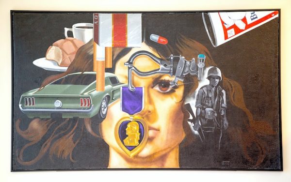
Mi Vida (1971-72) by Jesse Treviño, created in San Antonio. Courtesy of Glasstire

Jesse Treviño was another Vietnam veteran, he was drafted after his time in art school in New York. In 1967 Jesse was very seriously injured, a sniper shattered his femur and severed an artery while a booby trap left shrapnel wounds on him and the aftermath of this would lead to the amputation of his right hand and forearm in 1970, his dominant hand used for his paintings. It was another veteran named Armando Albarran that encouraged him to start painting with his left hand in 1968, Armando pushed him to it so much that Jesse painted Armando so he would leave him alone. Painting with his left hand was painful, it caused his right side to hurt and it took a few weeks to complete the portrait because of this, it wasn't until 1970 that he would decide to amputate his right forearm. 

He thought that the amputation would help with the pain, but it didn't as phantom pain was just as bad. For six months after the amputation, he didn't want to paint, and he began to paint his bedroom wall after some deep introspection. His bedroom wall would become Mi Vida, he holed up in his room to complete in with only spotlights or light. Each subject within the painting related to his experiences in Vietnam and the aftermath of his time there, the purple heart medal he earned, and his prosthetic arm which he glued turquoise onto is featured in the painting. Also featured was the car he bought with his army compensation and what he used to get through his experiences; coffee, cigarettes, beer, and pills. 

This is my favorite piece that I chose, the fact that despite what he went through he still succeed as an artist and pushed himself to succeed. I'm also a fan of the collage style that he uses, each object has a specific meaning to him and tells his story, and how the woman's face is half covered but her one eye captivates you.

Yoko Ono & John Lennon

*Bed-In*

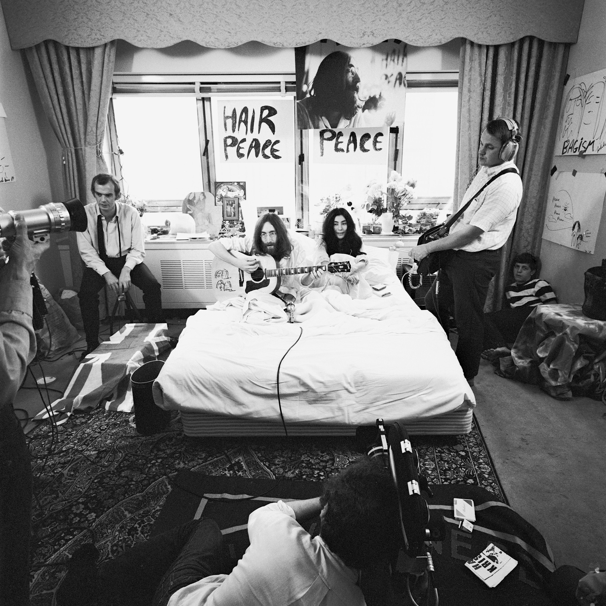
Bed-In (1969) by Yoko Ono and John Lennon in Montreal. Photo by Gerry Dieter. Courtesy of Museum of Modern Art.

The Bed-Ins for Peace were week-long protests by Yoko Ono and John Lennon against wars and to promote peace. These bed-ins were filmed and made into a documentary, they also invited interviewers to come. They, along with some other artists they invited, would sing Give Peace a Chance. They held the bed-ins in Montreal and Amsterdam following their marriage, they hoped to inspire peace and stop the war. These bed-ins would later inspire other artists to do something similar or influence their works.

I appreciate their intentions, but it is my least favorite. I know that they were odd people, but it is a little too odd for me. The fact that the press never really took it seriously also hurt their efforts. But again, I do appreciate them using their celebrity status to promote the things they believe in and try to make a difference.

Philip Jones Griffiths

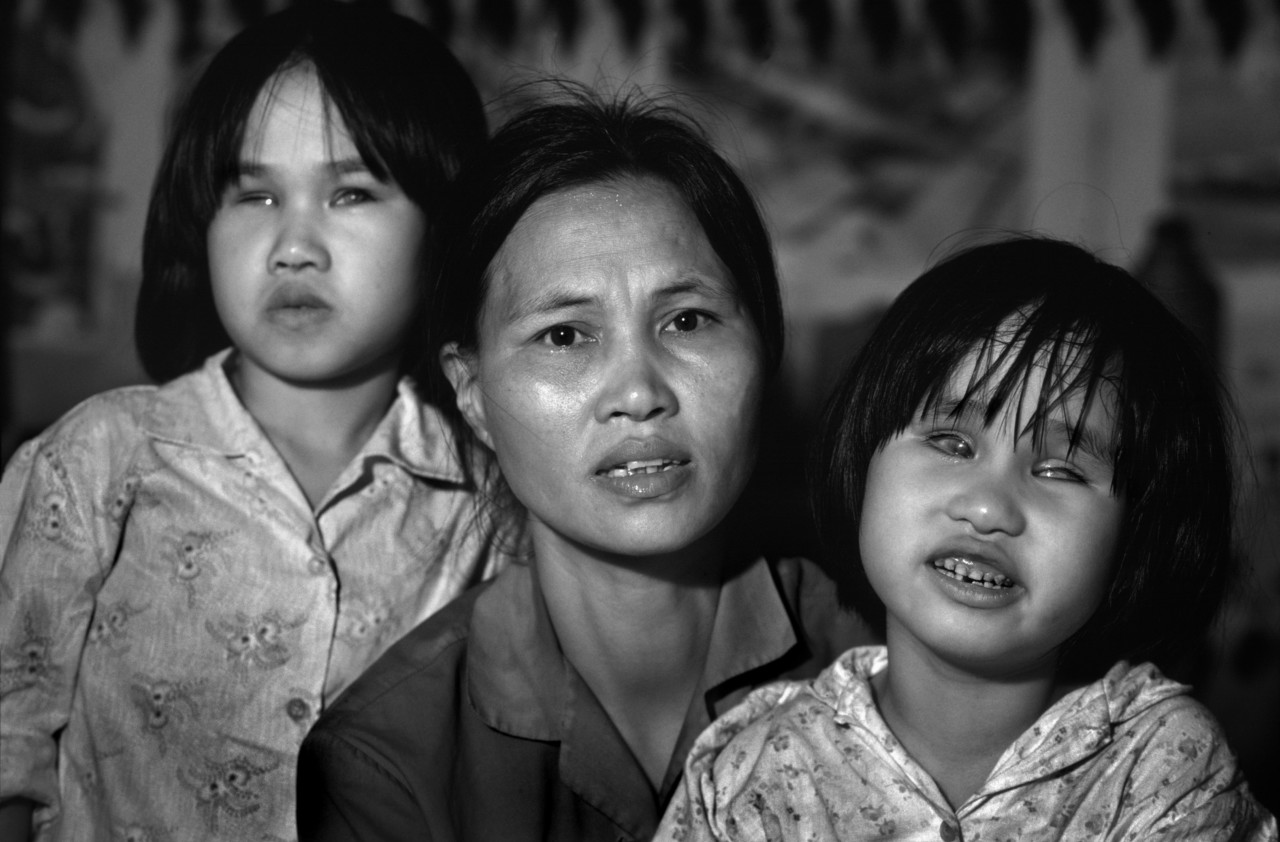
Philip Jones Griffiths, Vietnam 1980. Both daughters had been born blind due to the damaging effects of Agent Orange. Image courtesy of Philip Jones Griffiths.

The photographs taken by Philip Griffiths are very moving, I highly recommend looking at his Vietnam Inc photobook. Although I should warn that there are some disturbing images within the collection, such as a photo of a Vietnamese dancer who is attacked by U.S. Navy men she was performing for, it is implied that she was raped, and other photos show horribly injured people. 

All of the photos he takes are beautiful as they are disturbing, the black and white of the photos add to the story. I feel that if they were in color they wouldn't be as powerful, the lack of color lets the light be more dramatic. The photograph I chose from his collection is of a mother and her two blind daughters, the blindness is a side effect of Agent Orange and other Rainbow Herbicides that the U.S. used in Vietnam. The chemicals damage the genes and cause birth defects, this damage is still felt today in Vietnam. Their father was a truck driver who drove down a road that was repeatedly sprayed with Agent Orange. 

The emotions Griffiths is able to evoke in his photos really is unreal, he chose to photograph not just the U.S. soldiers, but civilians and the Viet Cong as well. He set out to tell people the real story of what was going on, even if it was a disturbing reality. 

Overall

The Vietnam War influenced many different types of artists and led to a lot of antiwar sentiment and art. It influenced artists from all walks of life, from those who served in the war, civilians, and celebrities. The sheer amount of different art created that was influenced by the war is amazing, there were performance art, paintings, songs, and so many different ways artists chose to interpret the horrors going on. Looking into it could be difficult because of the things that were done and documented, but I think it is important to acknowledge these things. The acts being so publicized on television and for the public to see some of the horrors was very different from past wars where the public really only knew what was approved to be reported on. 

Work Cited

Chicago, Judy. “Immolation, from the Portfolio ‘on Fire.’” Smithsonian American Art Museum, americanart.si.edu/artwork/immolation-portfolio-fire-113493.

Cordova, Ruben. “A Baptism of Fire: Jesse Treviño Paints 'Mi Vida'.” Glasstire, 26 Jan. 2019, glasstire.com/2019/01/26/a-baptism-of-fire-jesse-trevino-paints-mi-vida/.

Rosler, Martha. “Martha Rosler. Cleaning the Drapes from the Series House Beautiful: Bringing the War Home. c. 1967-72: MoMA.” The Museum of Modern Art, www.moma.org/collection/works/150123.

Seymour, Tom. “Philip Jones GRIFFITHS: A Legacy in Photobooks • Magnum Photos Magnum Photos.” Magnum Photos, 29 May 2018, www.magnumphotos.com/theory-and-practice/philip-jones-griffiths-legacy-photobooks/.

“Why the Vietnam War Still MATTERS: Connecting the Art of the 1960s to Our Time.” Why the Vietnam War Still Matters: Connecting the Art of the 1960s to Our Time –– Minneapolis Institute of Art, 25 Sept. 2019, new.artsmia.org/stories/why-the-vietnam-war-still-matters-connecting-the-art-of-the-1960s-to-our-time.

“Yoko Ono. Bed-in. 1969: MoMA.” The Museum of Modern Art, www.moma.org/audio/playlist/15/382.

Wednesday, July 14, 2021

Early Modernism: Influence of WWI

 After the destruction of World War 1, it was harder for artists to go back to more traditional and lighthearted art styles. Many of the styles that emerged were abstract and were more experimental than before. Some styles were even direct stances against what they believed to be the root cause of the war, tradition. 

Dada

The artists of the Dada movement took on a nihilistic view after the war rejecting tradition. Marcel Duchamp is said to have rejected art that was made for the eyes, and not the mind. They wanted to embrace the absurd, illogical, and many of the artists chose not to use the human form unless it was distorted or made to seem manufactured. 

Hannah Höch, Dada-Puppen, 1916/1918, Ausstellung "Dada Afrika", Berlinische Galerie, 2016. Foto: Urszula Usakowska-Wolff

Dada Puppen (1916) by Hannah Höch in Berlin, Germany. Courtesy of Kunstdunst

Most of Hannah Höch's work is dadaist photomontages, but this piece is a pair of dolls that are said to be inspired by Hugo Ball's performance at Cabaret Voltaire. It is said that the shapes of the doll's clothing resemble the geometric costume Hugo Ball wore during the performance; unfortunately, I could not find a photo to compare the two. Whether Hannah was truly inspired by Ball or not, the dolls give off an industrial feel. To me, they almost look as if they're wearing spacesuits.

I like the playfulness of the dolls, that you recognize them as the human form, but there is something very off about them. The colors of the dolls aren't very vibrant and that they're disjointed, but I think it adds to the mechanical feel. What I like most of all are the shapes within the dolls, how the taller one has a triangular skirt and the circular forms on the smaller doll's shoulders and knees. Many in the dada movement believed that technology was turning mankind into machines themselves, and it is speculated that this is what Hannah was trying to portray. Another speculation as to why Höch, and other dada artists, portrayed the human form as mechanical or mutilated is the many soldiers who returned home as amputees and with prosthetics. 

Surrealism

Surrealism was created from dadaism and influenced by Sigmund Freud and dream worlds. Some artists focused on creating whatever comes to their mind with no planning, while others focused on dreamscapes and the unconscious mind. Artists turned to surrealism after they thought dadaism became too organized and lost its original intent. 

Artwork by Remedios Varo, Insomnia, Made of Gouache on paper

Insomnia (1947) by Remedios Varo in Mexico. Courtesy of MutualArt

This painting was actually commissioned by the Bayer company to advertise sleeping pills, it represents what insomnia feels like. What I really like about this piece is the hard lines throughout the painting, and the weirdness of the scene. To me it really does seem like a sleep disorder come to life with the eyes watching from every corner, and there is a sense of anxiety and sense of being trapped in a dark space. The perspective that Varo uses, makes it so the viewer can see through multiple doorways, so the eyes to look both far away and very close adding to the feeling of unease. 

Surrealism continues the uncertain and darker imagery that was born from post World War 1 sentiment that dadaism had, but it starts to focus more on projecting those feelings, along with influences from Freud, into dream like worlds. Personally, I prefer surrealism over dadaism but it is mostly due to aesthetic tastes. I like how experimental and creative the dada movement was, but something about surrealism apeals to me more. 

De Stijl  

De Stijl, meaning the style, was a reaction to the excess of art deco, and so this style focuses on form and function rather than any frills. It was also a reaction to the horrors of war, the movement wanted to recreate society and uphold an idea of a utopia. Many artists embraced geometric shapes and lines and creating harmony in their designs. 

gerrit rietveld shroder house de stijl

Rietveld Schröder House (1924) by Gerrit Rietveld in Netherlands. Courtesy of The Collector

The architecture of the De Stijl movement is pretty iconic, you can see the geometric shapes that inspired the design clearly and there are pops of primary colors that are a staple in this style. Inside the house there are sliding walls to make spaces bigger or smaller depending on the need. I like the architecture of this art style, but the other forms of art work are a little too simple for my taste. I appreciate the emphasis on function that the artists had and some of the creative solutions Rietveld had for the house. I reccomend that people look at other views and more inside photos of the house, it is pretty cool inside.

SP2018-Rietveld-Schroderhuis-15-HiRes.JPG

Inside view of Rietveld Schröder House

Final Thought

All three of these art movements are the aftermath of World War 1 and the reaction to the horrors of it. Some styles are a commentary on what they believe is the cause, and others are ways to try and transform the world after the chaos. All three are very different than the styles that came before them, the focus of art was changing during this time. I think all three are very interesting and learning the context of the pieces is as interesting as the pieces, some art styles I prefered over others but overall they're all visually interesting. 

Sources

Dadaism - Art and Anti Art, Arty Factory , www.artyfactory.com/art_appreciation/art_movements/dadaism.htm.

Seiferle, Rebecca. “Remedios Varo Artworks & Famous Paintings.” The Art Story, 20 Sept. 2017, www.theartstory.org/artist/varo-remedios/artworks/.

Souter, Anna. “Hannah Höch Artworks & Famous Photomontages.” The Art Story, 21 Jan. 2016, www.theartstory.org/artist/hoch-hannah/artworks/.

“Surrealism Movement Overview.” The Art Story, 21 Dec. 2011, www.theartstory.org/movement/surrealism/.

Trachtman, Paul. “A Brief History of Dada.” Smithsonian.com, Smithsonian Institution, 1 May 2006, www.smithsonianmag.com/arts-culture/dada-115169154/.

“Unesco World Heritage in Utrecht.” Rietveld Schröder House, 9 June 2021, www.rietveldschroderhuis.nl/en/rietveld-schroder-house.

Wolf, Justin. “De Stijl Movement Overview.” The Art Story, 22 Nov. 2011, www.theartstory.org/movement/de-stijl/.

Thursday, July 8, 2021

Romantic Era

The Era

The Romantic Era took place during the 1800's, the predominant art styles of this period included the romantic, realist, impressionism and post-impressionism, and art nouveau styles. There were many new styles of art as exploration and shifts in society continued to expand, as well as some styles being created in direct opposition of another art style. As the world continued to evolve, as did the art world.

I am choosing to focus on art nouveau and the realist movements, but I cannot truly saw I choose one style over another. These two styles are drastically different from each other visually, both groups made stances for their own beliefs. The realists were anti-institutional and sought to take a moral stance against the bourgeois, and the art nouveau sought to bring back quality craftsmanship and step away from historical styles of the past and rebel against academic art.

Alphonse Mucha - Art Nouveau

 Princess Hyacinth(1911) by Alphonse Mucha, Czech Republic. Courtesy of Mucha Museum

This art nouveau ballet poster is by Alphonse Mucha, who was a prominent figure of this movement. This poster exemplifies the art elements that make art nouveau; muted colors, flowy and organic ornamentations, and taking inspiration from nature. The muted color palette is throughout the poster and the natural elements is seen with the floral decorations on Princess Hyacinth. The iconic art nouveau ornamentations is seen within the circle that goes around Princess Hyacinth; if you look closely at it you can see motifs that relate to the story of the ballet such as blacksmith tools, a crown, and sorcery instruments. 

I highly recommend browsing other works by Mucha, I enjoy a lot of his posters and designs. The only criticism I have is that a lot of his female characters look very similar to one another, but he did do a lot of series of paintings, such as a series titled The Moon and Stars,  so that may be why. 

Jules Lavirotte - Art Nouveau 

photo immeuble lavirotte

Lavirotte building(1899-1901) by Jules Lavirotte, Paris, France. Courtesy of Un Jour de Plus a Paris

This apartment building in Paris, France was designed by Jules Lavirotte and had won a facade competition in 1901. Looking at the decorations around the doors, windows, and balconies you can see how many curved and organic lines that make up the design. Above the entrance you see a woman, it is not clear who the inspiration for her is but some say it was based on Lavirotte's wife, and to the sides of her are Adam and Eve. What many art nouveau artists strived for was to bring back craftsmanship and break away from traditional designs, which is what he accomplished. The outside has glazed ceramic tiles which was new at the time, and the sculptures and ironwork were designed by Lavirotte, but made by local craftsmen. Inside the structure he used an early form of reinforced concrete and built the walls to have a layer of air in them to provide better soundproofing. 

While I may not build an apartment like this, at the time it was innovative and new techniques were used during the construction.

 I like art nouveau art and furniture design, but for me the architecture falls a little flat compared to other styles. I do like all the curves in the design of the building and how the decorations are nature inspired such as the iron lizards that decorate the door (a little hard to see in the photo above). The one criticism I would have is the supposed erotic elements of the building, while I am not sure it is intentional it is how some interpret some of the elements. Some of these elements include the phallic looking door, the iron lizards I liked so much are supposedly in reference to a French term for genitals, and some people say they see other erotic imagery within the decorations. I'm not sure how common it was for buildings to have such elements, to me it seems out of place in a building you would live in.

Art Nouveau Paris Jules Lavirotte Facade

Top portion of the Lavirotte building

Jean-François Millet - RealismThe Gleaners (1857)

 The Gleaners (1857) by Jean-François Millet, France. Courtesy of The Art Story

Millet, like many realist painters, depicts non-idealized events of the working class. Gleaners were workers who came after harvesters to pick up anything that was left behind. It is said that Millet chose to paint three women to represent the three movements gleamers did; bend, pick, and stand back up. What I really like about the realist movement is the artists stance to show everyday life, even if people thought it was ugly and not catering to the tastes of the wealthy. When Millet had this painting on display in France, there were many reviews that called it ugly and the women homely. 

The elements of art that I like about the painting are the color palette, form, and texture. The muted colors adds to the sense of everyday and that these are workers going about their day, nothing glamorous. The form of the women gives a sense of them being three dimensional in this space, you can see their shadows and depth in the painting. There isn't a lot of texture, it mainly is within their clothing and the grass from the field. 

Gustave Courbet - Realism

  Young Ladies of the Village, Gustave Courbet (French, Ornans 1819–1877 La Tour-de-Peilz), Oil on canvas

Young Ladies of the Village(1851-1852) by Gustave Courbet, France. Courtesy of The Met

Courbet is another French realist who was criticized for making the figures "ugly". Which I don't agree with, they look fine to me, and he had based the women on his sisters so I doubt he thought they were ugly. He was also criticized for the size of the cows, which I can agree with, they look too big to be part of the background and too small to be part of the foreground compared to the size of the dog. 

Courbet did paintings to showcase his hometown of Ornans and those who live there, he also wanted to capture everyday life even if it seemed flawed or what wasn't considered beautiful. I love the texture on the dog, you can see how fluffy he is and there are patched of dirt and rock that you can just picture how they feel. The perspective is off, the cows are definitely the wrong size, but I don't think it throws off the whole painting as the focus is on the figures. I like that it shows real people going about their day, something I think is important that helps us today get a sense of what life was like during this period

Final Thoughts

I couldn't find a movement of art that I truly didn't like, I feel there will always be pieces in each movement that you like or dislike. It is interesting that many of these styles were happening at the same time or just right after the other one went out of style. Personally, the flair of art nouveau is more visually interesting, but I do like the everyday aspect of many of the realist paintings.

Sources

“Art Nouveau Architecture in Paris' 7th Arrondissement.” Paris Perfect, 28 Sept. 2020, www.parisperfect.com/blog/2011/03/art-nouveau-7th-arrondissement/.

“Art Nouveau Movement Overview.” The Art Story, 21 Jan. 2012, www.theartstory.org/movement/art-nouveau/.

Foundation, Mucha. “Princess Hyacinth.” Mucha Foundation, www.muchafoundation.org/en/gallery/browse-works/object/246.

“Gustave Courbet Paintings, Bio, Ideas.” The Art Story, 21 Feb. 2010, www.theartstory.org/artist/courbet-gustave/.

Ibrahim, About Afzal. “The Gleaners.” Artist PopLab, 27 Apr. 2020, www.theartist.me/artwork/the-gleaners/.

“Realism Movement Overview.” The Art Story, 21 Mar. 2015, www.theartstory.org/movement/realism/.

“Young Ladies of the Village.” Metmuseum.org, www.metmuseum.org/art/collection/search/438820.

Monday, June 28, 2021

Classical Art- Morality

 The Classical Era

During this period of art there are two very distinct styles that emerge, Rococo and Neoclassical. Rococo is a style that is very light, pastel colors are often used, and very indulgent. While Neoclassical art is often very serious and depict morally good concepts, a very hard shift from Rococo style. This shift in style comes from the evolving public view of the monarchy and public morals.

Rococo

During the first half of the 1700's it is the wealthy and powerful aristocrats who hold the power in society, and the most influence on the art world as they were the majority of the patrons during this time.

Ceres (Summer)

Antoine Watteau, Ceres (Summer) (1717/1718), Paris, France. Courtesy of National Gallery of Art

Rococo style reflected the world of the aristocrats, over indulgent and elegant. Ceres by Antoine Watteau shows off this pastel and elegant style and was created towards the beginning of the Rococo period. This piece was a part of series based on the seasons, but the other seasons have been lost over time, and was commissioned by Pierre Crozat for his hotel in Paris. 

While not ornate as other pieces from this time, it is still beautiful and soft. I do enjoy this piece, and wish the other seasons had survived. I do think the lion is very interesting, definitely not an accurate lion, the rest of the picture is beautiful.

It was a hotel owner who commissioned it, as at the time it was only the wealthy or aristocratic who patroned the arts, who could afford to do so. They pushed forward these decorative and elegant pieces that are just for show.

Triumph of Venus

François Boucher, Triumph of Venus (1740), Paris, France Courtesy of Artsy

Boucher became someone who helped define the Rococo style as playful, and even erotic. Again this showcases the styles over the top idealization and ornate finesse. The characters within the painting are practically glowing, and cherubs fly through the sky. This piece was commissioned by Count Tessin, and showcases what the middle class were starting to get disgusted with from the artistocrats, over indulgance and loose morals. 

It is a detailed piece, and the color palette is soft. I think it is beautiful, not something I would have in my own home, because it is over the top. I find it interesting that the women all have a glow to them, especially Venus, while the males do not. I find that my eye follows the ribbon to Venus, and that despite how much is going on in the painting, she still is the main feature.

Neoclassical

The Neoclassical style is a dramatic shift away from the Rococo style as the public views on morality change. This style is more somber, darker colors, and with the discovery of Pompeii antiquities becomes prevalent again. The biggest change from Rococo is the arts depict morals and stories of heroism, rather than frivioulous scenes. 

The Death of Socrates, Jacques Louis David (French, Paris 1748–1825 Brussels), Oil on canvas

Jacques Louis David, The Death of Socrates (1787), France Courtesy of The Met

The Death of Socrates displays the somber atmosphere of neoclassical art with muted colors and heavy subject matter and is heavily influenced by antiquities. This was painted by Jacques Louis David following the French Revolution, and depicts Socrates dying for refusing to renounce his beliefs and choosing death willingly for his cause. 

Following the public's views on morality and disgust with artistocrats, the arts begin to show stories such as Socrates and other heroes or martyrs. 

I like the overall aesthetic of the Rococo period, but appreciate the messages Neoclassical art portays. I like how clean and to the point David's painting is, and how despite that Socrates is about to die he still is still giving one last lesson before his death. 


Sources

Baetjer, Katharine. “The Death of Socrates.” Metmuseum.org, 2017, www.metmuseum.org/art/collection/search/436105. 

Conisbee, Philip. “Ceres (Summer).” Art Object Page, 1 Jan. 2009, www.nga.gov/collection/art-object-page.46149.html. 

“François Boucher Artworks & Famous Paintings.” The Art Story, www.theartstory.org/artist/boucher-francois/artworks/. 

Gersh-Nesic, Beth. “Neoclassicism, an Introduction.” Khan Academy, Khan Academy, www.khanacademy.org/humanities/renaissance-reformation/rococo-neoclassicism/neo-classicism/a/neoclassicism-an-introduction. 

Monday, June 21, 2021

Baroque- Bernini's Apollo and Daphne


Apollo and Daphne, Bernini courtesy of Borghese Gallery

Background

This sculpture was created by Gian Lorenzo Bernini and finished in 1625 as a commission from Cardinal Scipione Borghese. The sculpture itself depicts the story of Apollo and Daphne from Ovid's Metamorphoses, in this story Apollo was shot by Cupid's arrow and pursues Daphne who rejects him. Despite this Apollo continues his pursuit until Daphne prays to her father, a river god, who turns her into a laurel tree. When you get close-up views of the piece you can see her hands and hair transforming into branches, and parts of her skin turning into tree bark.

A video from Smarthistory about the story of Apollo and Daphne as well as more angles and a closer look


Baroque influence

The video above also does a great job explaining the Baroque elements of the culture. 
As Dr. Beth Harris and Dr. Steven Zucker discuss in the video, Bernini captures the moment Daphne is just starting her transformation into a laurel tree which a lot of Baroque art does, it captures a moment just before something happens and has a tense atmosphere. The figures are not stable like many of the Renaissance sculptures are, there are curves and Apollo himself is in motion and on one foot. The faces express emotion and the viewers can see the tension and feel the drama of the piece.


Comparing to the Renaissance

Bacchus (1496-97)

Bacchus, Michelangelo 1497 courtesy of The Art Story

Looking at Bacchus which was sculpted by Michelangelo, you can see the difference in styles immediately. In this piece despite Bacchus being drunk, he is still in a stable stance and both feet touching the ground. There aren't any dramatic curves through the sculpture as in Baroque art, and I find it harder to read his expression as anything but blank. 

While Michelangelo is indeed a master, you can see the difference in the drama and emotions expressed in the different eras of art. Renaissance art focused on beauty and perfection, while Baroque focuses more on the tension and emotions the piece are supposed to convey. The best way I think of it is that Renaissance art focuses more on the after or even during an event, while Baroque is the moments leading up to the event or just as the event is happening.


The Council of Trent's Influence

The Council of Trent were three sessions that took place between 1545 and 1563, this was the Catholic Church trying to come up with ways to counteract the Protestant Reformation. They wanted all works of art, from paintings to songs, to be easier for an everyday person to understand which was very different from the Mannerist approach. They also wished for art to hold morals and values within them. Bernini agreed with the Council of Trent that art should be easily understood and invoke emotions in the viewer, which can be seen in his works. 

Members of the church are were among his commissioners during this period, such as Cardinal Scipione Borghese, and even Pope Urban VIII. Along the bottom of Apollo and Daphne, there is an inscription in Latin "Those who love to pursue fleeing forms of pleasure, In the end find only leaves and bitter berries in their hands", which was a poem by Pope Urban VIII. This inscription gives this sculpture that is based on mythology, a moral that is taught in the churches.


My Thoughts

This is one of my favorite pieces by Bernini, the emotions and movement he was able to capture within the sculpture are amazing. Not only that but how he was able to capture this in-between moment as Daphne is starting her transformation is what I love about it. I hope to one day see it in person to really appreciate the details and look at it from multiple angles. Theoretically, I would own this piece or a replica, but realistically I wouldn't have the space for it. 

I really enjoy more of the art within the Baroque period than the Renaissance, I find the style more appealing and how emotional and dramatic the pieces are. 


Sources

“Apollo and Daphne by Bernini.” Galerie Borghèse, 2 Aug. 2019, borghese.gallery/collection/sculpture/apollo-and-daphne.html.

“Apollo and Daphne.” Artble, 19 July 2017, www.artble.com/artists/gian_lorenzo_bernini/sculpture/apollo_and_daphne

Cooper, James F. “Bernini.” Newington-Cropsey Cultural Studies Center, 2008, www.nccsc.net/essays/bernini. 

“Medici: Godfathers of the Renaissance . Renaissance . Counter Reformation.” PBS, Public Broadcasting Service, www.pbs.org/empires/medici/renaissance/counter.html. 

Thursday, June 10, 2021

Humanism within Jan Van Eyck's work


Ghent Altarpiece open

History of the Altarpiece

Jan Van Eyck and his brother Hubert were commissioned to paint the polyptych Ghent Altarpiece by patrons Jodocus Vijd and his wife Elizabeth Borluut for the Church of Saint John (now known as the Cathedral of Saint Bavo) in Ghent, Belgium (Hickson). It is unknown when the two brothers began their work, but it is believed to have been before 1422 and completed in 1432. Another thing still unclear is how much each brother contributed, but it is widely believed that it was Jan who completed most of the panels. 


Jan van Eyck, Ghent Altarpiece (closed), completed 1432, oil on wood, 11 feet 5 inches x 7 feet 6 inches (closed), Saint Bavo Cathedral, Ghent, Belgium (photo: Closer to Van Eyck)

Ghent Altarpiece closed, patrons Jodocus and Elizabeth are in the bottom corners of the piece

Exterior 

The exterior of the piece, which is what was on display for most of the year, contains three layers. The bottom layer from left to right contains Jodocus, St. John the Baptist, St. John the Evangelist, and Elizabeth. The middle layer contains the Archangel Gabriel and Mary, it depicts Gabriel announcing to Mary she'll be the mother of Christ. The very top layer has the Prophet Zacharias, Erythraean Sibyl, Cumaean Sibyl, Prophet Micah. 

The amount of detail the Van Eyck's were able to achieve is evident, especially in the middle layer with Gabriel and Mary. In the window between the two, you can see the skyline of Ghent 

View of Ghent through the window in one of the panels between the Mary and Gabriel (detail), Adoration of the Mystic Lamb, bottom center panel, Jan van Eyck, Ghent Altarpiece, completed 1432, oil on wood, 11 feet 5 inches x 7 feet 6 inches (closed), Saint Bavo Cathedral, Ghent, Belgium (photo: Closer to Van Eyck)

Details from the window between Gabriel and Mary


Interior

There is so much going on within the interior and it is a huge piece, I'll include a diagram of what each panel is representing and some close up of the details. Being that this is an altarpiece, the images and symbolism are very religious. The bottom layer is depicting people coming to the Holy Lamb, a symbol of Jesus Christ. In the close-up of the Holy Lamb, you can see that the lamb is bleeding and is said to represent the Eurachrist. Behind the altar with the lamb are angels carrying the cross, crown of thorns, and nails that Jesus Christ was to have been subjected to before his death. 

There is a lot more symbolism present, but unfortunately to get into all of that would probably take a whole book and cannot fit into one blog post. 

Diagram, Jan van Eyck, Ghent Altarpiece (open)

Interior view labeled


Adoration of the Mystic Lamb, detail, Jan van Eyck, Ghent Altarpiece (open), completed 1432, oil on wood, 11 feet 5 inches x 15 feet 1 inch, Saint Bavo Cathedral, Ghent, Belgium (photo: Closer to Van Eyck)

Zoomed in view of Adoration of the Holy Lamb

God/Christ (detail), Jan van Eyck, Ghent Altarpiece, completed 1432, oil on wood, 11 feet 5 inches x 15 feet 1 inch (open), Saint Bavo Cathedral, Ghent, Belgium

Close up of the Deity

Humanism

The humanism influence in Jan Van Eyck's work can be seen throughout this altarpiece. It is present in the amount of detail and beauty within the piece and each part of the piece represents something and has its own role. He is presenting divine figures as beautiful and as human, and linear perspective can be seen throughout which emerged during this time period. Each person, angel, and animal within the painting is done with care and purpose. You still get a sense that this is a religious work, but there is also a sense of reliability within it as well.

My Thoughts

This is one of my favorites done by Jan Van Eyck, its something you could stare at all day and still find something new within it. While I am not particularly religious, I can appreciate the symbolism and how stories from the bible are depicted. His mastery over oil paints is obvious when you get in close to the panels and spot all the small details hidden, and stepping back and seeing it all together you can see the story.

Work Cited

Hickson, Dr. Sally. “Jan Van Eyck, The Ghent Altarpiece.” Smarthistory, 9 Aug. 2015, smarthistory.org/van-eyck-the-ghent-altarpiece/.

“Jan Van Eyck Biography, Life & Quotes.” The Art Story, www.theartstory.org/artist/van-eyck-jan/life-and-legacy.

Pioch, Nicolas. “Eyck, Jan Van.” WebMuseum: Eyck, Jan Van, 19 Sept. 2002, www.ibiblio.org/wm/paint/auth/eyck/.


Non-Western Art

 Nihonga Movement The Nihonga movement started in 1882 as a direct result of the forced opening of Japan in 1853 during the Meiji Period. Wh...